Graphing data
Data can be graphically represented.
Bar charts and pie charts graph data based on categories.
Line graphs and scatter plots graph continuos data.
Data can be graphically represented.
Bar charts and pie charts graph data based on categories.
Line graphs and scatter plots graph continuos data.
Patterns and trends in data
A trend is the direction data appears to be heading.
A trend is the direction data appears to be heading.
- A positive trend is when the data is increasing in value.
- A negative trend is when the data is decreasing in value.
When two sets of data are linked together we can say that they have a correlation. Sometimes the correlation is positive and sometimes it is negative. If the two sets of data has no relationship, then we say that there is no correlation. Here are some examples:
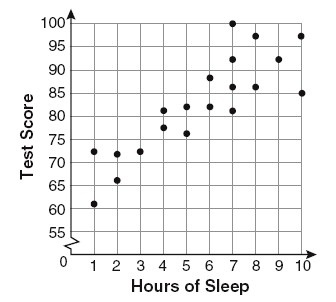
The correlation is positive when both sets of data increase together. Eg: When the hours of sleep increase, the test scores increase too.
|
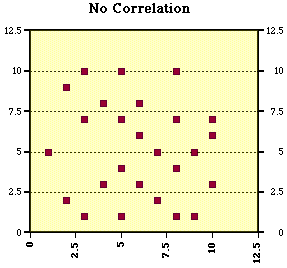
There is no correlation if there are no obvious patterns you can see on the scatter plot.
|
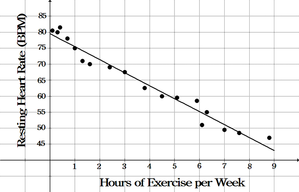
The correlation is negative when one set of data decreases as the other set increases. Eg: When the hours of exercise increase, the resting heart rate decrease.
|
